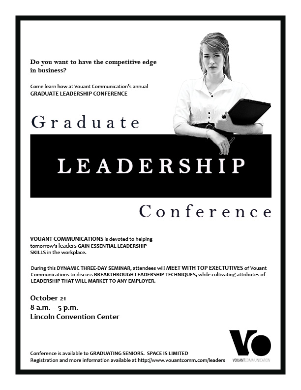
Description: Black and white flier promotion for graduate leadership conference
Process: First, I had to get my brain juices flowing by sketching out some design ideas. The image, logo, and text were given to me to use for this flier. I started by situating my text in Adobe InDesign. Once I felt good about the positioning of the text I placed the logo and image. I brought the message to the forefront by boldly contrasting white on black. Alignment was crucial for this flier to look just right. In the body copy I used bold caps to bring out the message I wanted for the audience.
Message: I wanted graduates to know what they could expect to gain by attending this conference.
Audience: Graduates and graduating seniors.
Top things learned: Alignment creates a clean, crisp, professional look.
Title Font Name and Category: Bell MT — Old Style
Copy Font Name and Category: Candara regular and Bold — Sans Serif
Links to all Images and Text Used: Logo, Text and Image.

Recent Comments