Project Corrections / Time spent: I was not able to make corrections to my projects.
Message: I have learned a great deal about design in the last 13 weeks
Audience: Classmates and future employers
Top Thing Learned: I learned that I can create.
Future application of Visual Media: I can create good, clean messages in a variety of areas. I think this gives me a log up and sets me apart from others.
Color scheme and color names: Monochromatic, Blue
Title Font Name & Category: Sneaker Script, decorative
Copy Font Name & Category: Century, Serif
Thumbnails of Images used:
Sources (Links to images on original websites / with title of site): Picture


My video that explains my design: https://youtu.be/2e4bmCbxAGM
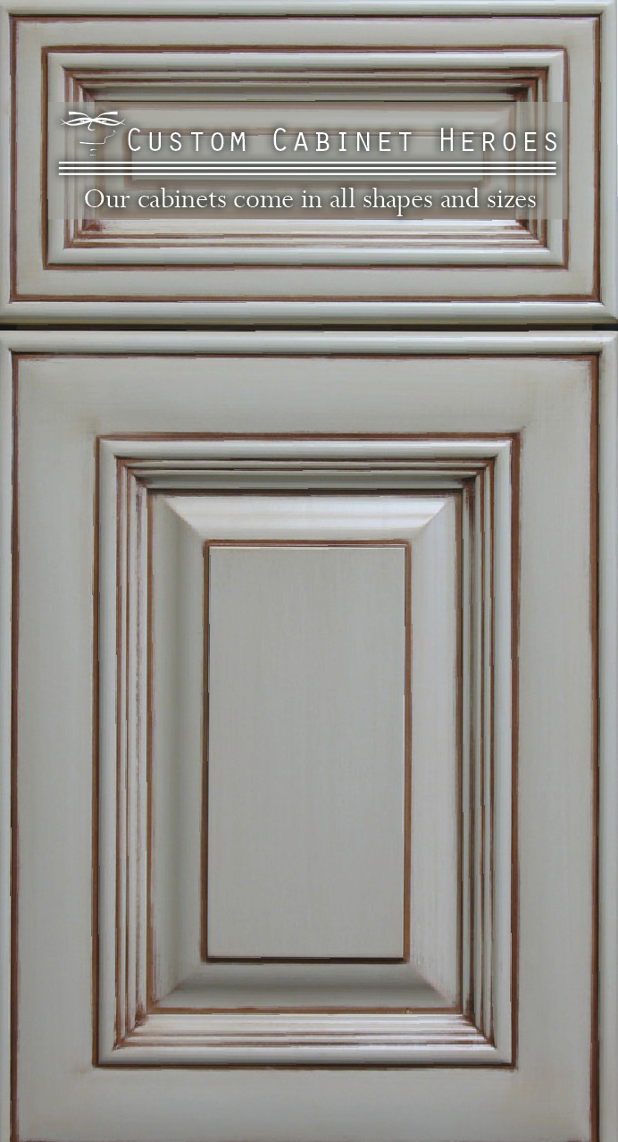
Description: This is a brochure I created out of thin air. I designed the logo after many hours of trying to figure out what I was going for. I realized I needed something clean, simple. This is what I came up with. You are welcome.
Process (Programs, Tools, Skills): I used a process called sketching and figured our how I wanted this brochure to look. I used Photoshop to cut out the young lady from her background. I placed her and added a text wrap to the image. I used InDesign to put everything together. It was a mess, until I was given a lot of critiques that helped me clean it up.
Message: This was designed to create confidence, and trust in a company that has been serving the community for years. It is also displaying the many varieties the provide
Audience: People looking to remodel or build a new home. Kitchen lovers.
Top Thing Learned:I learned that brochures are a pain in the rear! I took a lot of time to come up with the idea and feel I wanted to portray.
Color scheme and color names: Analagous: brick, orange, yellow.
Title Font Name & Category: Orator Std: Sans Serif
Copy Font Name & Category: PT Serif: Serif
Word Count of copy: Around 260
Thumbnails of Images used:


Sources (Links to images on original websites)
Girl Standing: http://www.clker.com/cliparts/e/f/2/e/1356710696398127201standing%20people.jpg
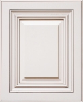
Small cabinet doors: https://s-media-cache-ak0.pinimg.com/736x/1c/19/ee/1c19ee036093a24c786989fca4a2d322.jpg
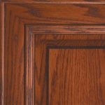
Small Cabit door #2 http://www.kitchenmagic.com/wp-content/uploads/2012/12/Washington_Cherry_on_Red_Oak_Wood_Kitchen_Cabinet_Doors.jpg
Small door #3 http://www.domaincabinetsdirect.com/images/AntiqueWhiteGlazeSampleDoor.jpg
 Description:My very first Website. I designed this for my wife’s handmade crafts store.
Process (Programs, Tools, Skills):I worked hard on this. I used Photoshop and word wrangler to write the html and CSS code. It took a lot of patience in order to validate all the coding
Message: Classy handmade products.
Audience: Crafters throughout the world
Top Thing Learned: Coding is actually really fun. It takes time to get everything just right, but once you do it is very gratifying.
Color scheme and color hex(s): Monochromatic, Purple
Title Font Families & Category: Satisfy – script
Copy Font Families & Category: Bree – serif
Changes made to the CSS: Font styles, background images, colors, alignments, personal notes, opacity and transparency.
Word Count: 325


Description:This is a business card and matching stationary for a pest control company that I made up. The card information is also made up so do not try to contact.
Process (Programs, Tools, Skills): For this project I used the curved line tool, quick shapes and the line tool. I messed around with a bunch of different fonts to give it the right look.
Message: This is a pest control co. that is ready to protect your home from pesky pests.
Audience: Anyone with a hate for spiders and bugs
Top Thing Learned: I learned patience and a little better on how to use InDesign and Illustrator. I learned no matter what, you have got to keep working on a project until you feel it is just right.
Color scheme and color names: I used a Red Monochromatic color scheme.
Title Font Name & Category: OCR A std – Sans Serif
Copy Font Name & Category: Myriad Pro – Sans Serif

Description: I designed this logo for my wife’s Etsy Website. My wife sells all types of hand made products but her specialty is in the art of crochet.
Process (Programs, Tools, Skills): I used Adobe Illustrator for this project. I sketched some ideas out on paper and got some great insight from those that critiqued my work.
Message: Handmade elegance.
Audience: People that love handmade crafts, but hate to make it themselves.
Top Thing Learned: I learned that anyone can design in AI. I am not an artist by any stretch of the word, but with AI I was able to create this tasteful logo. I feel confident I could create a logo for anyone now. I also learned that great logos have great people performing the critiques. I also became more familiar with color schemes and contrasting fonts.
Color Scheme and Color Names: Monochromatic/Violet
Title / Body Font Names & Categories: Xiomara/Fertigo Pro

- Description: This is a spiritual montage. The man is burdened by the pain of worldly sorrow with the hands of God holding him.
- Process (Programs, Tools, Skills, Steps taken while designing): I started with prayer, then started sketching unit I felt creative. I used Photoshop to create this montage. I used the brush tool to blend the two images, I used the burn tool to darken the man’s hair. I held several critique sessions to get the opinions of others.
- Message: No matter what we are going through, whatever pain or sorrows we feel, we are in his watchful eyes and gentle hands.
- Audience: Anyone that is looking for peace and comfort. God’s love is unto all of his children.
- Top Thing Learned: I learned how to carefully blend and use contrasting colors to really bring out the text.
- Filter / Colorization used and where it was applied: I applied a change to the hands using a change in saturation and hue. I also gave an outer glow to the text along with a drop shadow and gradient overlay.
- Color scheme and color names: I used a monochromatic color scheme using a darker brown and softening to a lighter brown.
- Title Font Name & Category: Minion Pro Regular – Oldstyle
- Copy Font Name & Category: Minion Pro Italics – Oldstyle
- Thumbnails of Images used:


- Sources (Links to images on original websites / with title of site): Hands – essentailthingdevotion.com, Man – costir.wordpress.com, Quote – lds.org


Description: This is a photo design for farmers throughout the world. Thank you.
Process (Programs, Tools, Skills, FOCUS principles): I took close to 90 photos before I found this one. I took the photo myself and worked with it in Photoshop. I followed the rule of thirds by placing the John Deer Gator on the side.
Message: I saw the Gator and it immediately made me think of the farmers throughout the world. It’s a thankless job and I thought this would be a vibrant way to remind us.
Audience: Anyone that eats food needs to be reminded.
Top Thing Learned: I learned that photo shop is crazy awesome! You can do so many things with it. I also learned a lot about color schemes.
Color scheme and color names: I used Analogous- Yellow, lime, and gold.
Title Font Name & Category: Optima Extra Black – Sans Serif
Copy Font Name & Category: Lucida Bright Demibold – Old Style
Thumbnail of original.
Date and location you took the photo(s) I took this photo on the BYU-Idaho Campus 10/12/15


I used a nice Cannon camera for the first time. You can thank the iPhone for that. I really haven’t done any photography before, so this was a great experience. I walked around looking for anything that spoke to me. I laid down in the dirt trying to get those shots nobody has ever seen. I had a great time messing with the camera settings trying to get things just right. All in all, it was a great learning experience.
I feel like photography is a beautiful way to express yourself, to tell your story if you will. As I was taking photos I felt my inner creativity coming to life in beautiful colors. I am excited to get better in this area.

Description: This is a full-bleed ad for a fundraising event created using only Microsoft Word.
Process: I always sketch before I start designing, it helps me get my brain working. I found the picture in the May, 2015 Cosmopolitan. The moment I saw this strong woman in boxing gloves I new how I wanted the design to look. However, after a couple of critique sessions, I had to make some changes. I used text boxes and shapes to create this ad.
Message: To fight back against domestic violence.
Audience: Women and anyone willing to fight for a good cause.
Color scheme and color names: I used a Monochromatic color scheme. Red, with black and white added.
Top Thing Learned: You should always let some critique your work. In fact, thanks to all who offered time to critique this ad. I really appreciate the insight.
Title Font Name & Category: The title and body is Cambria – Oldstyle. The font across the women’s face is Bauhaus 93 – Decorative.
Copy Font Name & Category:
Scanned images used, sources, original sizes, location of scanner used:

Recent Comments